TXT Maytal Huijgen | IMGS Wim Crouwel / Aisling O' Connor / Maytal Huijgen
[about systematic design for multiple platforms]

One of the greatest challenges in digital layout designing is the countless variety of platforms. As opposed to the fixed print size of a book, the digital devices vary by size between each reader. There are many mobile devices sizes in different proportions and they keep on changing every year. In edition, while designing the layout for a mobile device, the reader's device is always unknown.
What certainly remains common to both print and digital layout design is the use of a grid. Designing with grid allows a playful yet structured positioning of the content. The grid provides a foundation for designs who needs to be repetitive on the one hand and variant on the other. Books content is one of them.

Wim Crouwel, the known Dutch graphic designer who just passed away this September, has created grids to serve as a base for structuring logos, fonts and content. Working for both cultural and commercial clients, Crouwel also had to adjust each graphic languages to multiple formats. The use of the grid in print allowed adjustments between flyers to billboards, from a two-page spread ad to a business card. When thinking digital, the idea remains the same: how to use the same method to construct multiple digital output formats: iPhone 7, iPhone X, Samsung Galaxy S10, iPad Pro, Asus ZenPad and so on.
"The principles of design have not changed. Only the world is in a constant change." - Wim Crouwel on an interview to Nicola-Matteo Munari
Grids are created by using vertical and horizontal lines, forming margins, columns and baseline for texts and images. This systematic mapping of a format allows flexibility for different formats on the one hand and visual stability on the other. The content will be displayed on different devices of different dimensions, but will look and feel the same in all of them.

Defining a grid sets up not random, but pre-planned areas for the content. Once the grid is set, 'injecting' the content is much faster than when designing each page separately. This is true for print, and crucial for digital platforms.
Grids are already being used in many digital websites. On the other hand, the current digital e-pubs are ordering the texts in a full-page, centred layout as default. As opposed to the e-pub format, designing the new digital reading experience should re-embrace the grid work for creating a more exciting typographic reading experience.
"Even the posters that Crouwel designed from the late 1950s already look so digital: Consistent and sleek in design, clear in message, and so undiminished modern." Arjen Ribbens, NRC
In 2012, Unit Editions Publishers created the catalog for a Wim Crouwel exhibition at the Design Museum in London, titled "Wim Crouwel: A Graphic Odyssey". In 2012, they released a digital version of the catalogue as a free iPad app.

The app's design is based on the printed catalogue's content and visual language, but wisely does not try to imitate the paper but to embrace the screen layout and interactive possibilities. My favourites are a serie of 4 playful animations, demonstrating Crouwel's fonts construction. The animations are credited to Dan Flynn. Unfortunately, I still haven't found him online but hopefully one day I can share them here.
Short Comments on other Digital Gridin' Projects
- The design of Silo Theater's website is a beautiful example for grid-based layouts. The constructive grid allow the playful visual language of the theatre to be smartly adjusted to the various mobile devices.

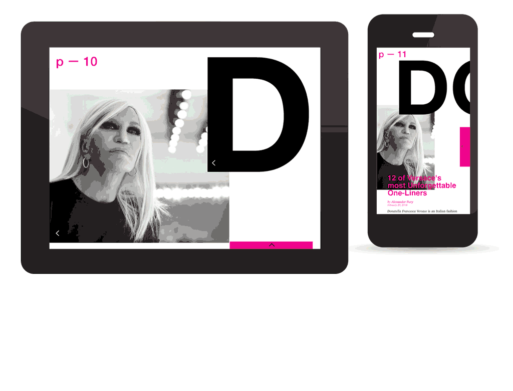
- Young graphic designer Nitzan Ben Moha has created a complete mobile magazine. In the issue titled "Rubber" she has created 5 grid-sets to serve 4 content-categories and one for presenting commercials. The visual language is smartly presented on both horizontal tablet format and vertical mobile phones . The use of moving grid is consistent yet very playfully.
In memory of Wim Crouwel, it would be super-great if @stedelijkmuseum will get a new digital publishing presenting Crouwel's contribution to the digital layout. What do you think?